Make One Thing on Your Page Stand Out With Motion
Keepp pages can now move: blocks that slide or fade in as visitors scroll, cards that lift under the cursor, and a pulse, shine or wiggle on the one block you want noticed, like your booking card or newsletter form.
Most pages have one thing they really want people to tap, like the booking card or the newsletter sign-up. On a page with twelve blocks, that one can easily look like everything else. A little movement fixes that faster than color or position can, because eyes go to whatever moves.
So Keepp pages can move now, and you choose how much.
Attention: for the block that matters most
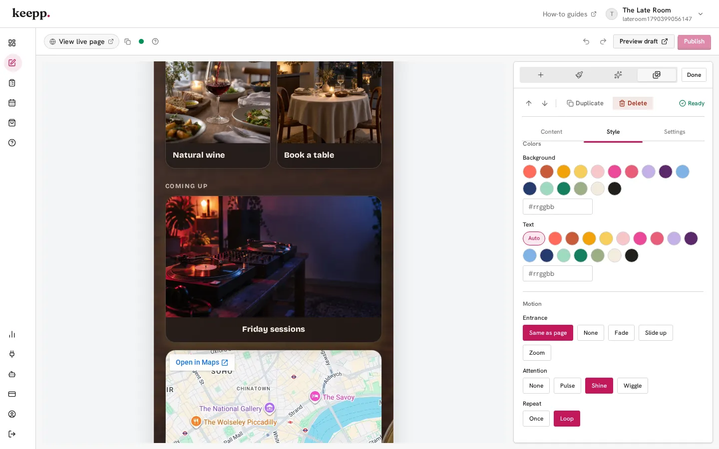
Select a block, open its Style tab, and scroll to Motion. Attention has three effects:
- Pulse makes the block swell slightly and settle, like it’s breathing in.
- Shine sweeps a band of light across it, the way a glossy card catches the light.
- Wiggle gives it a short shake, good for something playful.
Under it, Repeat decides whether the effect plays Once, when the block first scrolls into view, or on a Loop with a long rest between plays, so it keeps catching the eye without nagging anyone who’s reading the rest of the page.
It works best on one block, two at most. A shine on your enquiry form or a pulse on the card for this weekend’s event says “start here”. If every block wiggles, none of them stand out.
Entrance: how your page arrives
In Page style, the Motion section sets an Entrance for the whole page: Fade, Slide up or Zoom. Blocks animate in as visitors scroll down to them, and blocks that arrive together ripple in one after another rather than landing all at once.
Any block can go its own way. Its Entrance setting follows the page by default, or you can pick a different one for that block, or None to keep it still. A profile at the top often looks best still, with everything under it sliding in.
Hover and press: small responses everywhere
Hover, also in Page style, changes what happens when someone on a laptop points at a card, a link or a button: Lift raises it on its shadow, Grow makes it a touch bigger, and Glow rings it in your brand color.
Every button and card also gives a small squash when it’s tapped or clicked. That part is built in and always on, and on a phone, where nothing hovers, it’s what makes the page feel like it’s answering your finger.
It stays quick and easy to read
Visitors whose phone or computer is set to reduce motion get a still page, with every block in place. The effects are light, so your page loads as quickly as it did before.
When you pick an effect in the editor, it plays once right there on your page, so you can see it before you publish. Hover shows up in Preview draft and on your live page.
Templates come with it set up
Several of the templates start with motion already chosen to fit them. The Event Planner’s enquiry form shines, the Musician’s latest release catches the light, and the Café’s menu gives a pulse when it scrolls into view. You can keep those or change them like any other setting.
See style your page for every setting.